Research an existing website, with users that are 40-60 years old, that has bad UI/UX and improve it to be a responsive design.
Approach
Since the age group of users is Generation X (born between 1965 to 1980) the research was limited to their most-used websites; news, radio, property, and insurance. The scope of the search was also determined to South African companies.
Pam Golding was found to have the most UI issues and to see whether these issues affected the website’s usability, moderated user testing was conducted.
User Research
Firstly, moderated testing was done with four users (3 ladies and 1 man, all aged 40 -60 years old). They were given prompts and then observed how they navigate the site. After that, an interview was conducted to gauge their experiences.
Secondly, research was conducted on how best to design for Generation X, what info is important to them, and their online behaviour.
Persona
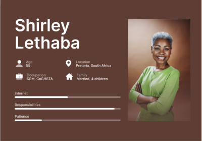
Shirley’s Pain Point is that she is looking to find an additional source of income. With her pension being around the corner she needs to make sure that she can enjoy her time off without worrying about expenses.
Deliverables
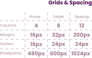
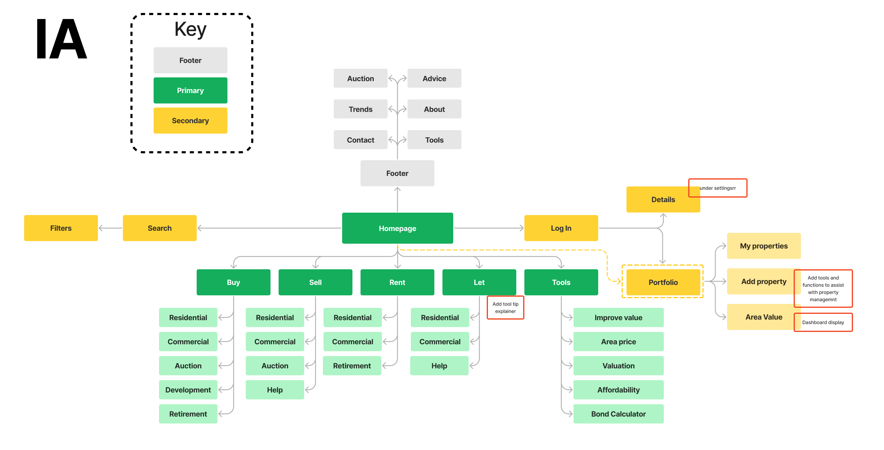
A restructured Information Architecture (IA) that follows common practices.
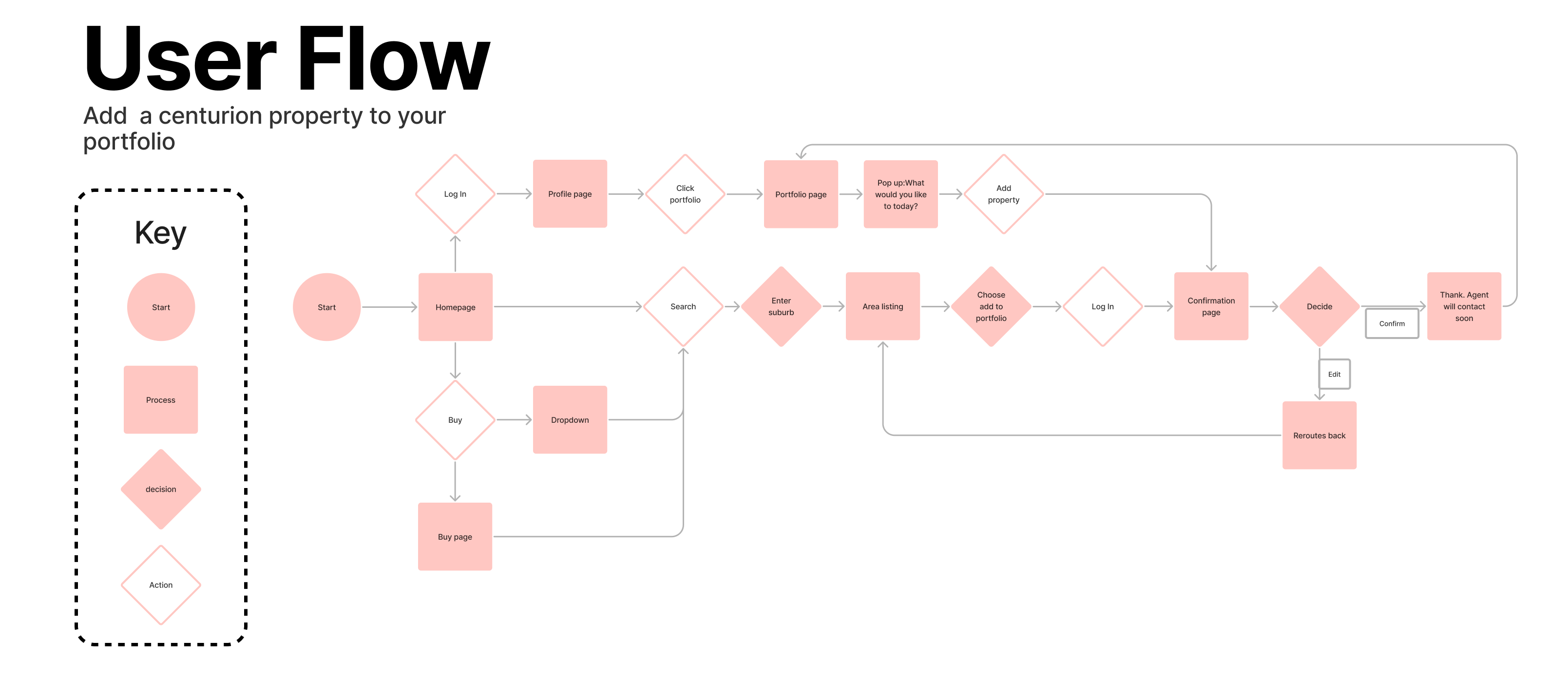
A User Flow modelled after the prompt “Add a Centurion property to your portfolio”
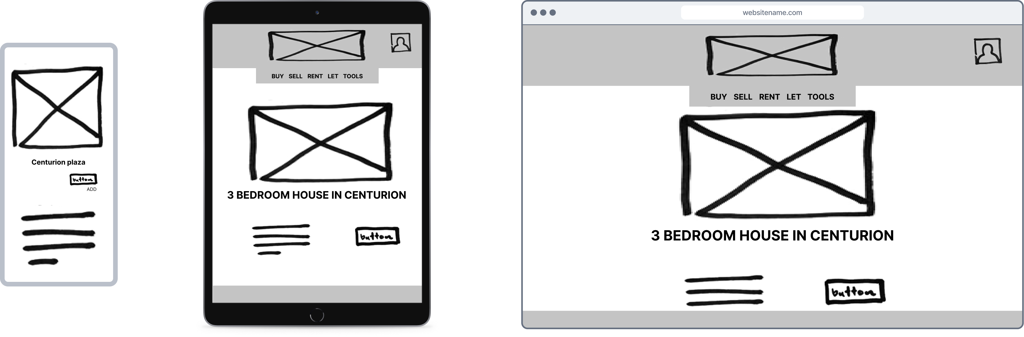
Wireframes for mobile, tablet, and desktop that follow the User Flow
Swipe for more
Design
Research
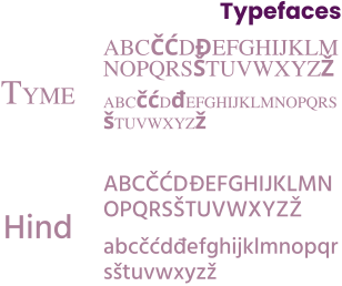
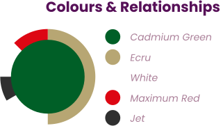
It is important to note that this was not a rebranding project so a lot of the elements remained the same. Namely, the colours and typography used. What was changed was how they were applied and their relationships.
Solution
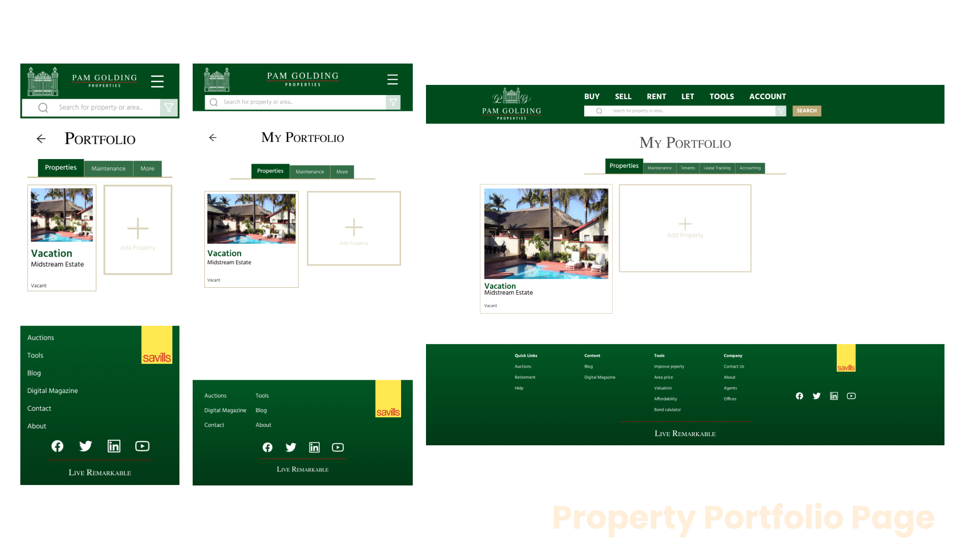
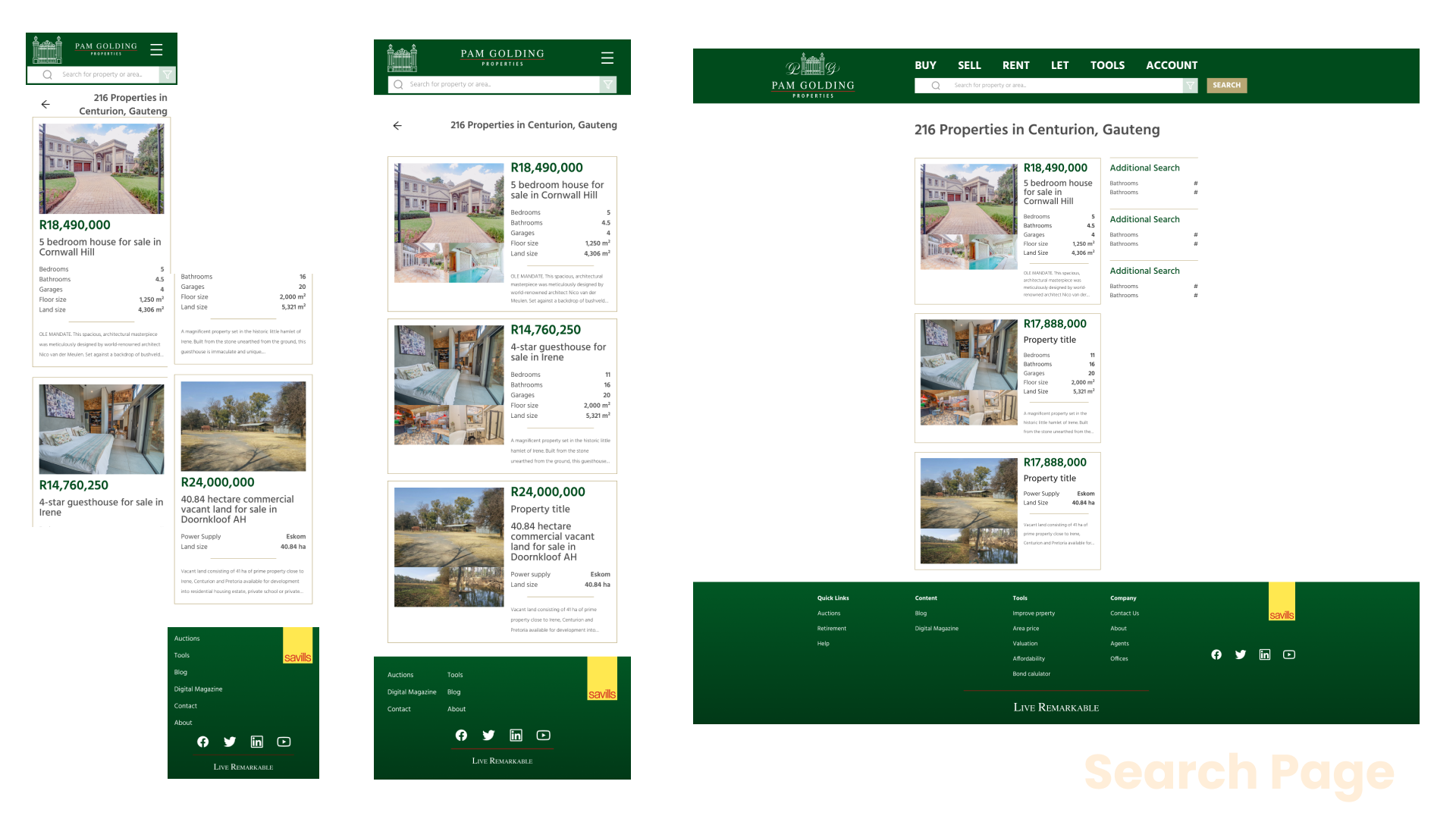
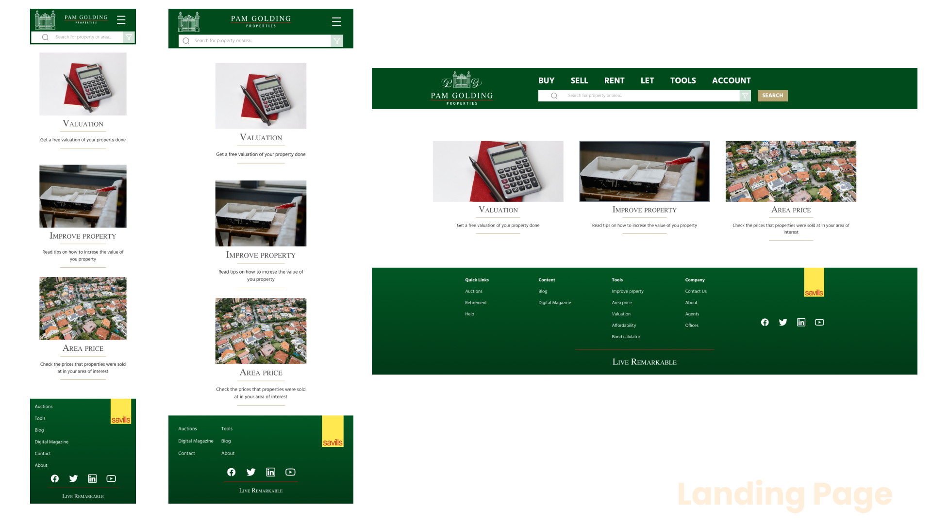
A property portfolio feature was added to allow users to maintain and manage all their properties from one place. This feature currently does not exist in the South African market. Mock-ups were designed for all three devices (mobile, tablet, desktop). Below are the frames from the different devices juxtaposed with each other. The frames are of the Home, Search and Portfolio pages.
Swipe for more
Here is a link to the current Pam Golding website:
This project showed me how important it is to have a responsive website. There are many devices being developed as technology progresses and all of them have varying screen sizes. There are no more templates and standardisations and thus an unresponsive website leads to less user traffic with each interaction. Companies like Pam Golding may experience issues as younger users (who behave differently) age and fall into their target.
Other Work

Pusha
Design
System
ENaTIS
Service
Re-design
ENaTIS
Service Re-design

Client
Side Project Product Team
Role
UX Research UI Design
Year
2022
Duration
3 weeks
Brief
You need to identify a problem area within the services delivery department of your community and develop a Web/Mobile application that will be a solution response to the identified problem.
Approach
We approached this brief as an opportunity to show how simple changes could be made to improve our government services. Since this was a service re-design, we did not change any of the branding. What was done instead was to improve the experience of the users of ENaTIS as well as improve the modus operandi of the Drivers Licensing and Testing Centre (DLTC).
User Research
Due to the time constraints of the project, the user research in the initial stages was based off reviews found on websites like HelloPeter as well as the Google play store. Around 145 reviews were sources for the insights below.
44%
Adverts
The mobile app was full of third-party ads.
48%
Paid for nothing
Services were paid for, but no delivery was received.
42%
Tech Errors
Errors such as crashes, corrupt forms, etc.
Personas
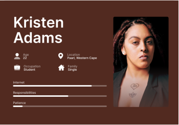
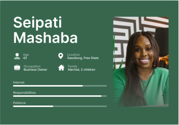
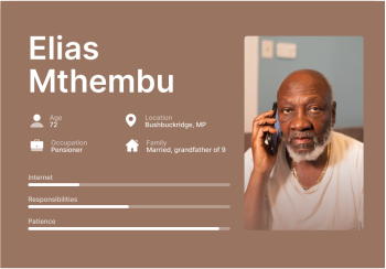
The personas were focused on three main user age groups (youth, matured, pensioner) that represented the three main product offerings (licenses, vehicle registration and roadworthiness of ENaTIS).
Pain Points
Kristen needs her learner’s (eventually driver’s) license so she may be eligible for more jobs.
Seipati struggles to keep her fleet of vehicles registered.
Elias has found it difficult to get his vehicle tested for roadworthiness.
Deliverables
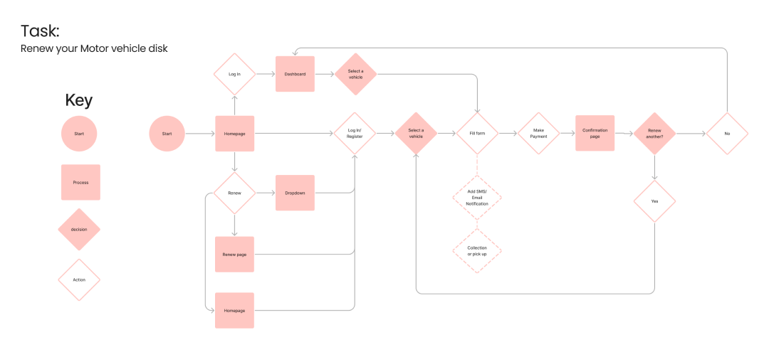
A user flow based off of the prompt “Renewing motor vehicle disk.” The most common task performed at the DLTC.
Design Research
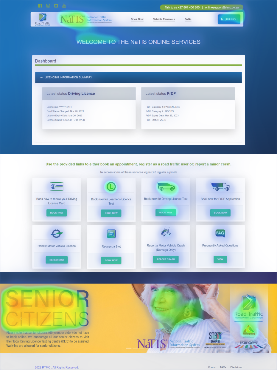
A site audit of the old site was done by using a heat-map. This allowed us to see how the hierarchy was laid out and which areas drew the most attention.
Solution
The focus of the solution was a mobi-site as it is the most used device by South Africans. We also wanted to demonstrate the ease of access and use of our redesigned website.
It is challenging to work on a government website for a personal project. It was difficult to find out which of DLTC’s service offerings had the highest demand. Once we had chosen one it was interesting to see how a system and a traditionally physical process can be improved and replaced by a digital solution.
Other Work
Pam
Golding
Responsive
Re-design
Pusha
Design
System
Pusha
Design System
Client
Side Project
Role
UX Research UI Design
Year
2022
Duration
4 weeks
Brief
Develop a design system for an existing or fictional wellness/fitness app. Make sure to present the system clearly and include use cases of the system’s principles.
Approach
The choice was made to develop a design system for a fictional wellness app as there were few opportunities for improvement on existing apps. Another factor was that there are no current apps that cater to people of colour (POCs), specifically from the African continent.
Research
The first stage was to find out how a design system is developed, the necessary elements and how they are displayed. Design systems of established brands (Apple, Google, Mailchimp, Atlassian, etc.) were also compared.
The second stage focused on the African diaspora. The demographics, cultures, sounds, surroundings, and artworks were considered. This was so that the design could be congruent with the environment of its user.
Design
System
Below are links to the full design system and a mobile prototype that shows the system in use. The system is represented as:
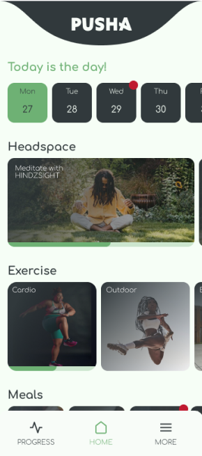
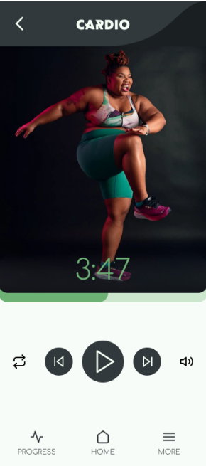
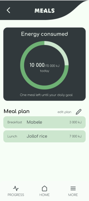
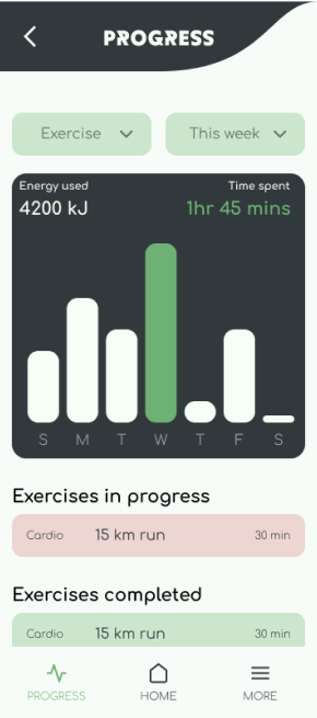
Here are some frames of the use cases of the design system.
Swipe for more
Takeaway
This was my first attempt at a design system, and I am converted. The presence of such a system is as fundamental as a business plan, it is not bound to represent digital elements but physical ones as well.
A design system is essential for businesses that aim for longevity as the system makes scalability easier.